1. Relative Gold chart - gold divided by its own 200 dma
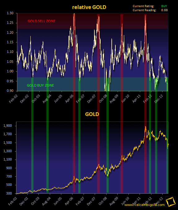
The r-GOLD chart is gold divided by its own 200 dma. It has proven to be a reliable indicator in spotting major bottoms and tops for gold in the past 10 years. Recently the rGold chart bottomed out again and points towards new highs in 2013.
2. GOLD & Monthly closes since 1970
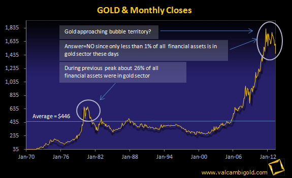
When experts claim gold to be in record high territories and therefore being in a bubble, they mostly refer to gold's long term chart (monthly closes). When looking at this chart one would easily believe that gold is a bubble indeed therefore an accident waiting to happen. It's recent high of $1925+ seems to be too far stretched from its long term average of $383. The problem however with this chart is that it is extremely distorted. The distortion arises from the fact that this chart doesn't take into account the loss of purchasing power of the dollar over time. Needless to say the purchase power of a 2011 dollar doesn't match the purchase power of a 1980 dollar. Yes, bull markets do end when approaching bubble territories, but we are far away from that. During previous 'real' highs more than 20% of all invested money was in gold and gold shares, today this percentage is still below 1%.
3. Gold & Historical Average measured against official government CPI statistics
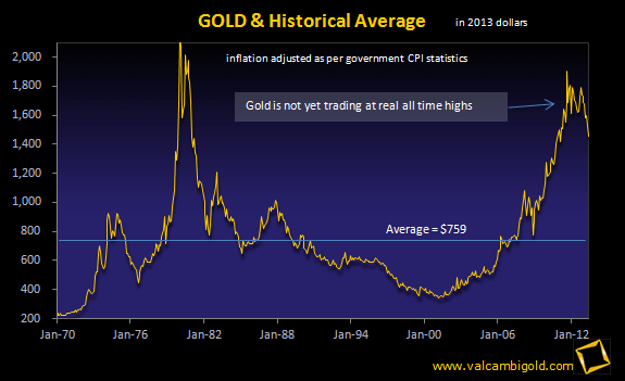
In order to calculate 'real' highs for gold one has to adjust for inflation. When using government inflation statistics then we'll see that the 1980 peak of $850 equals $2500+ today. Since no secular bull market ever ended without making new 'real' highs gold's current bull still has a long way to go.
4. Gold & Historical Average measured against John Williams' shadow CPI statistics
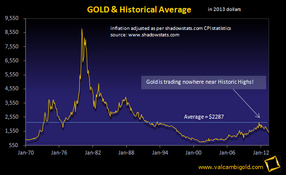
In order to calculate 'real' highs for gold one has to adjust for inflation. When using shadowstats inflation statistics we'll see that the 1980 peak of $850 equals $9000+ today. The inflation statics published by John Williams at www.shadowstats.com present a more realistic picture of true US inflation numbers. As this chart clearly demonstrates gold is far away from making new 'real' highs.
5. Gold & HUI - Gold shares vs Gold
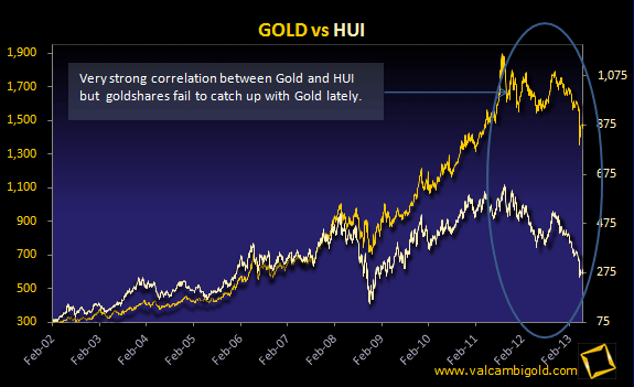
Gold shares move in tandem with the gold price. Historically gold shares tend to outperform gold to the upside but as of 2008 the gold hares have been lagging the price of gold tremendously. Such extremes as we're witnessing today won't persist for a long period of time, which will translate eventually into much higher share prices (mining shares).
6. Gold & DOW - Gold measured against the DJIA since 1930
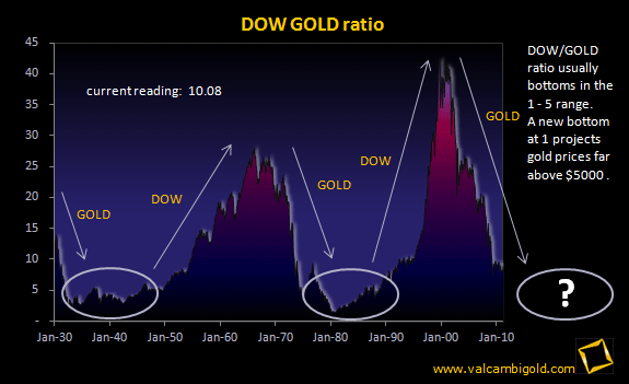
The DOW/GOLD chart is a powerful tool in order to determine major turnarounds. It's simple, when the DOW/GOLD chart tops you buy gold, when the DOW/GOLD chart bottoms you buy equities. Once you've established your position you can ride the wave up or down for at least a decade. The DOW/GOLD chart flashed a 'buy' for gold again in the year 2000 and indeed 11 years later gold is almost up 450% from its lows.
If it were all that simple why don't we hear that much about this powerful tool?
Well, the thing is the DOW/GOLD ratio chart isn't a useful indicator in order to predict yearly price movements. Next year could very well clock higher readings than this year instead of expected lower readings thereby losing confidence as being a reliable indicator. Unfortunately that's the same analogy as denying that higher temperatures will arrive in summer based on a single day temperature drop in spring. The problem is that the DOW/GOLD cycle has a wave length that's so big that we humans have a hard time to figure out where to position ourselves into this cycle
7. US Monetary Base M0 - Exploding Money supply :
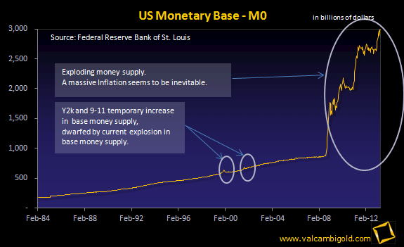
This chart clearly demonstrates that our current monetary system is broken. In times of economic stress/uncertainties government tends to inject enough liquidity into the system to keep things going. Then when things turn back to normal government drains the injected liquidity from the system. A good examples concerns the Y2K crisis and the 9-11 event. The banking crisis of 2008 however dwarfed all previous events, the base money supply tripled almost over night, yet, many people still don't understand why gold prices have tripled since 2008.
8. US Public Debt
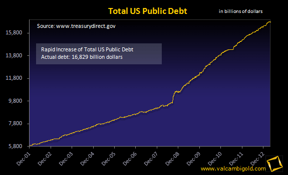
This chart represents the official US public debt which stand at $14+ trillion. Of course the real debt is multiples of the official public debt. Total US debt is about $57 trillion and total US unfunded liabilities exceed the $100 trillion mark.
9. US Treasuries and Foreign Holders
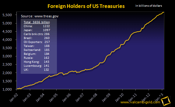
Sure enough the US spends more money than it earns. The gap is and has been financed by foreigners willing to buy US treasuries in ever increasing quantities. This trend seems to be coming to an end since foreign governments no longer value the US dollar as they used to. It is here when foreign governments start losing faith in the world's reserve currency, that gold reasserts itself as currency of choice. It is then when gold attempts to balance the balance sheet of the US. Gold prices required in order to counter balance the total US debt held in foreign hands exceed the $12.500 mark.
10. GOLD performance vs DJIA over a decade - Where was your money?
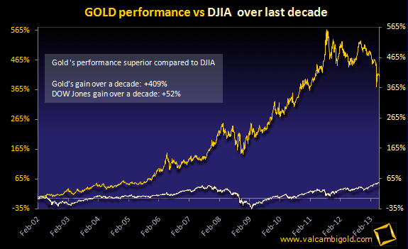
Gold started its current bull run in April 2001 after hitting a 21 year low at $256. Gold has been without doubt the investment choice of the decade closing the decade at an all time high of $1425 resulting in an astonishing gain of more than 550% and thus outperforming the DOW, NASDAQ and S&P 500 by great margin. Despite its stellar rise gold still hasn't caught interest of most retail investors, a clear indication this bull market still has a long way to go.
Original source: Valcambigold
Reproduction, in whole or in part, is authorized as long as it includes all the text hyperlinks and a link back to the original source.
The information contained in this article is for information purposes only and does not constitute investment advice or a recommendation to buy or sell.


