Over the past few weeks, gold has stolen the show as it again pierced the all-important $2,000 level before ascending to a fresh all time high around $2,180. During that time, silver rose a couple of dollars, remaining a long way off its all time high around $50. However things are about to change, and this week we'll look at a couple of charts of the silver/gold ratio that indicate silver may be about to lead gold during the next leg higher.
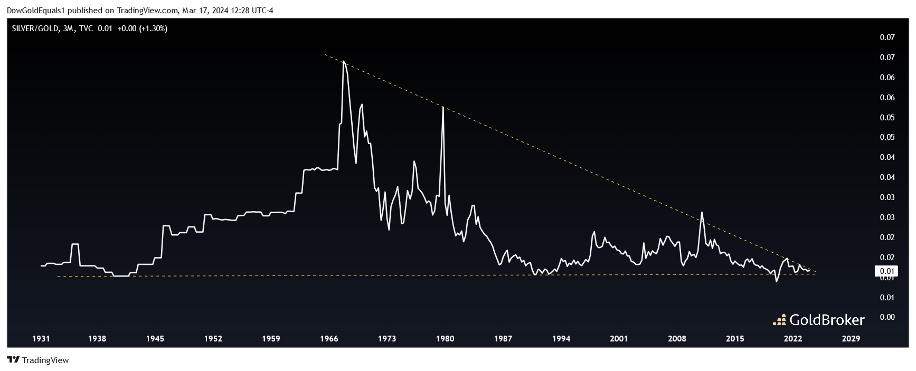
The first is a logarithmic chart of the silver/gold ratio. To review, when the chart is rising, silver has relative strength; when it is falling, gold is relatively stronger. Here, we can see that the ratio has traded within a fairly well defined channel over the last 100 years. Currently, the ratio is very near the bottom channel rail, suggesting that silver remains about as inexpensive relative to gold as it has in the past century! Next, note the dates when the ratio has fallen to the bottom rail:
- 1941 was just three years prior to the Bretton Woods Conference, when the price of gold was fixed, thus enabling silver to start outperforming.
- 1991 marked the final low of a brutal silver bear market that began at its 1980 high of $50 and ended at an astounding $3.46, the lowest price it's ever hit over the past 50 years.
- The second half of 2008 was during the heart of the Global Financial Crisis, when everything not bolted to the floor was sold off.
- 2020 was during the sell-off created by the Covid panic.
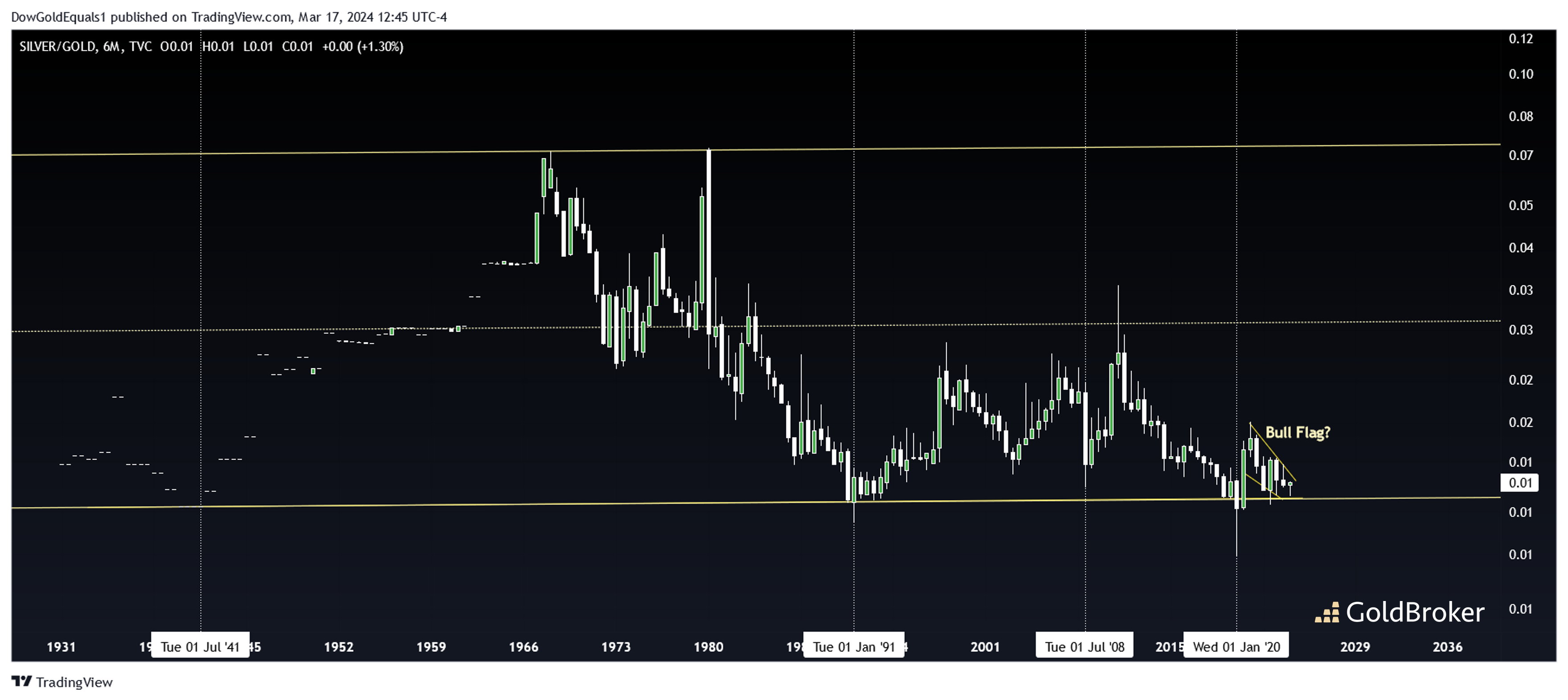
As the ratio now sits around the lower rail, historical context shows us just how important this moment is. History also shows us that this will not last for long, and silver is about to start outperforming gold once again. That the ratio is forming a bull flag just above the lower channel rail provides even more evidence that we are about to see a significantly bullish leg for silver. A return to the channel mid-line would be perfectly reasonable, which means silver would outperform gold by 3X along the way.
The second chart we'll look at is a linear view of the silver/gold ratio. Since ratio charts generally do not move logarithmically, it is often helpful to take that linear view. Here, we see that the ratio has been coiling for more than 50 years, and now we are right at the apex of the wedge. The false breakout in 2020 suggests a bullish move to follow.
One thing seems clear: this ratio is about to make a pretty big move.
Reproduction, in whole or in part, is authorized as long as it includes all the text hyperlinks and a link back to the original source.
The information contained in this article is for information purposes only and does not constitute investment advice or a recommendation to buy or sell.


