Just last week, we looked at the silver/gold ratio and noted that it suggested a big move in silver was about to commence.
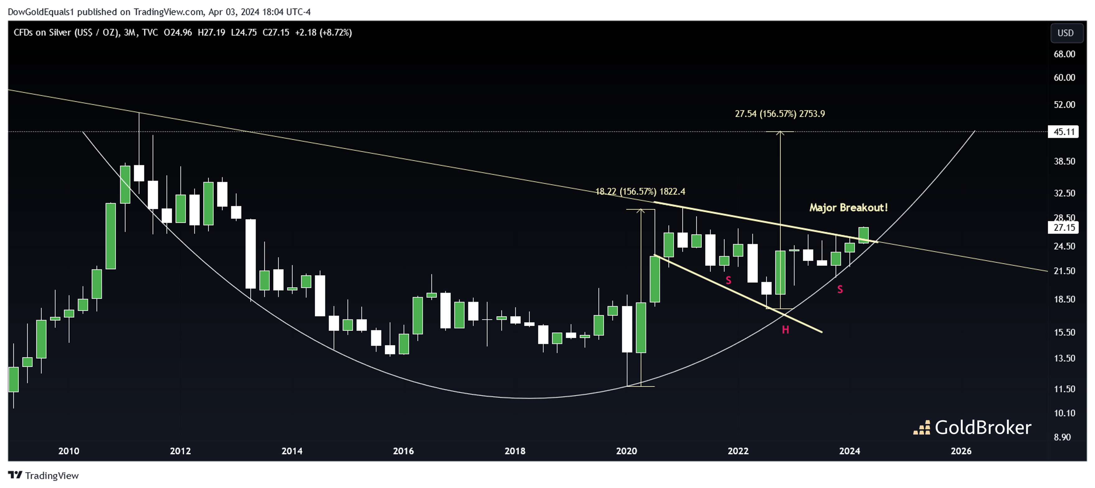
In that short time, silver has risen about 10% to around $27. We've been anticipating a breakout on this quarterly silver chart for some time, and it now looks like we are starting to get it. If the breakout holds on a quarterly closing basis, we will look for a bull flag measured move to the top of the arc at around $45 over the next couple of years.
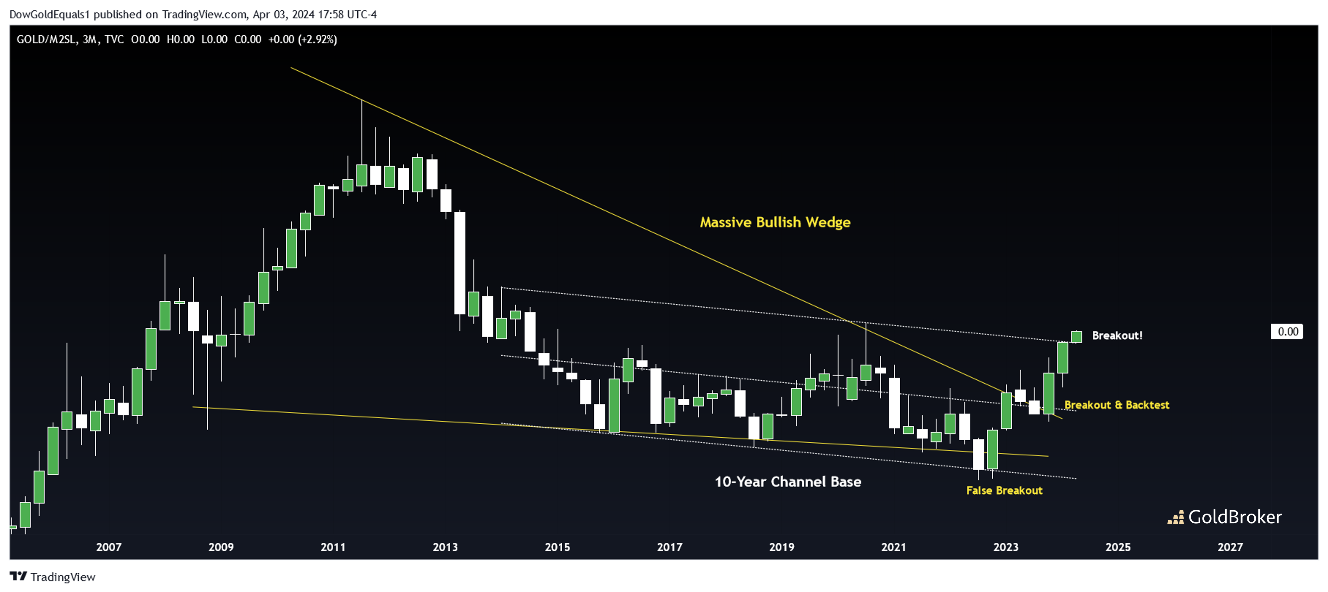
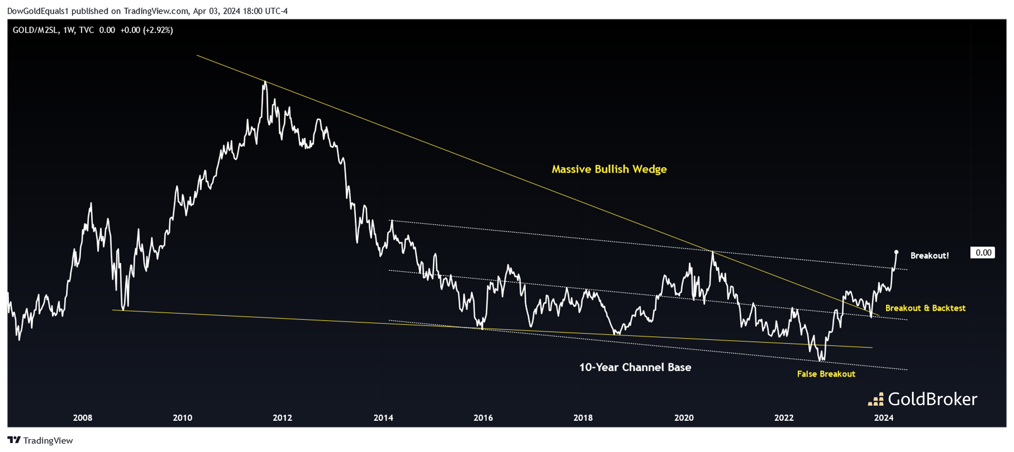
The above two charts are a ratio of gold to the US Money Supply, a chart we last reviewed this past July. To review, gold needs to be outperforming Money Supply to be in a bonafide bull market. Last year, the ratio was just backtesting a massive bullish wedge, and we were looking for an impulsive move higher to follow. We can see now that, not only has that impulse move begun, but the ratio has also broken out of a huge 10-year channel base. This suggests the ratio has far higher to climb, which means so too does gold not just in nominal terms but also in purchasing power.
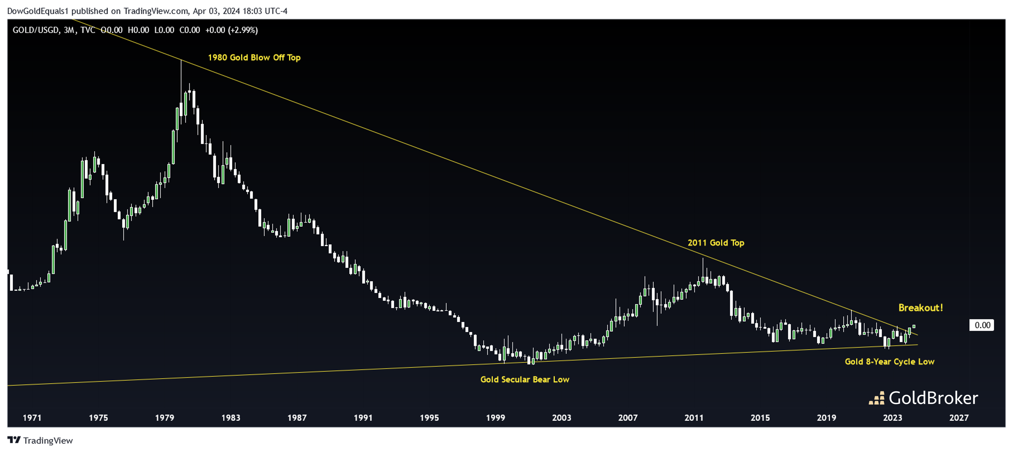
The final two charts are a ratio of gold to US Government Debt, also charts we last saw in July. Back then, we saw the ratio was still coiling within an historic 50-year wedge. Now, we see that the ratio has broken out to the upside. When gold outperforms US Government Debt, it is in a massive bull market. That we've broken out of such a large structure suggests we could be in for a gold bull market for the ages!
Reproduction, in whole or in part, is authorized as long as it includes all the text hyperlinks and a link back to the original source.
The information contained in this article is for information purposes only and does not constitute investment advice or a recommendation to buy or sell.


