This week, I'd like to look at some big picture charts of gold and silver fractals. I'm dedicating this week's analysis especially to those who believe that technical analysis works only on smaller time frames to see if these charts might make you reconsider.
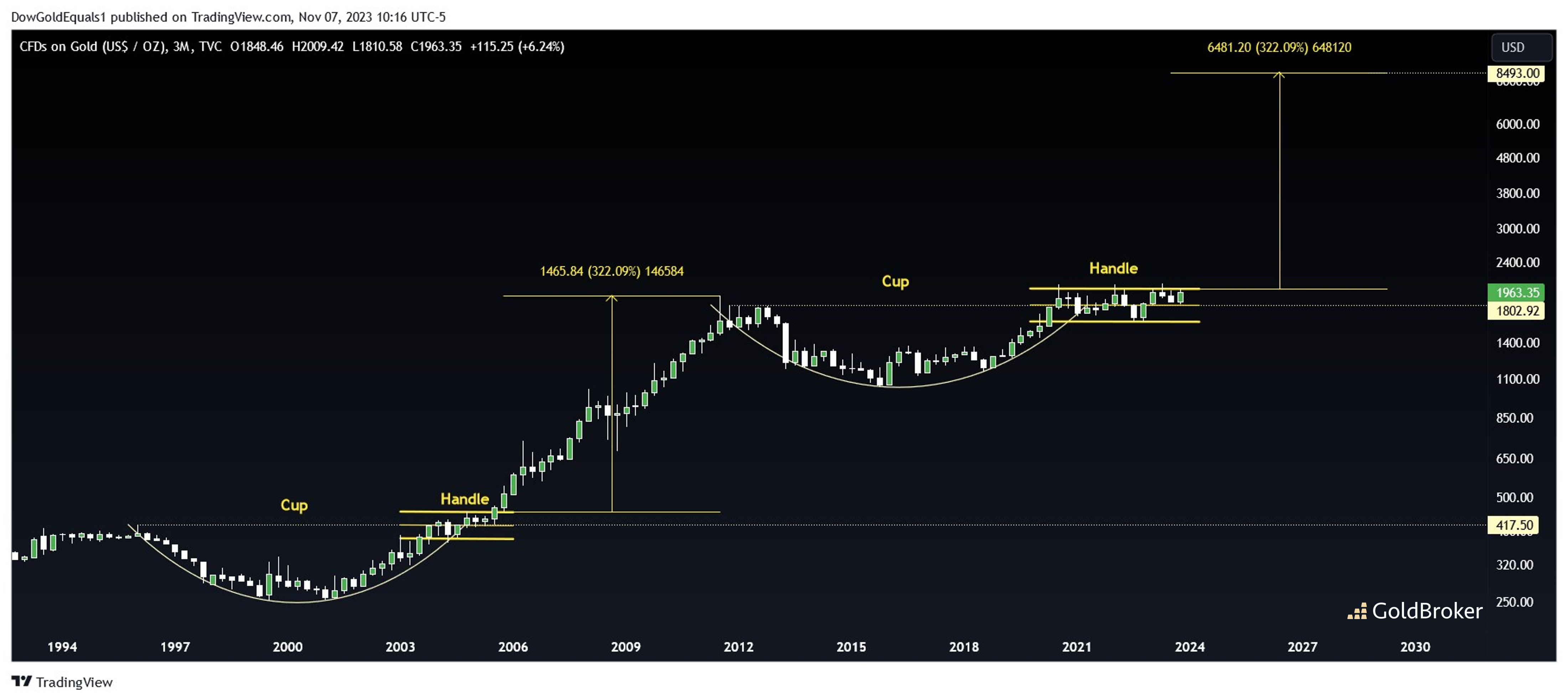
We'll start with gold and note the familiar 10+ year Cup & Handle that began in 2011, a chart that I've shown you a few times before. The biggest point of criticism I receive on this chart is that the time frame is just too long for the pattern to be valid. However, we only have to go back to the period between 1996-2006 to see a nearly identical Cup & Handle that formed and eventually propelled gold price nearly 8X to its 2011 historic high. Interestingly, both handles consolidate around midlines that are equal to their historic highs a decade earlier - now that's some fractal! Also of note: If the current C&H breaks out and rises an equal percentage to that of the last C&H breakout, the total move from the 2016 low will be about 8X, the same as the move from $250 in 2001 to nearly $2,000 in 2011.
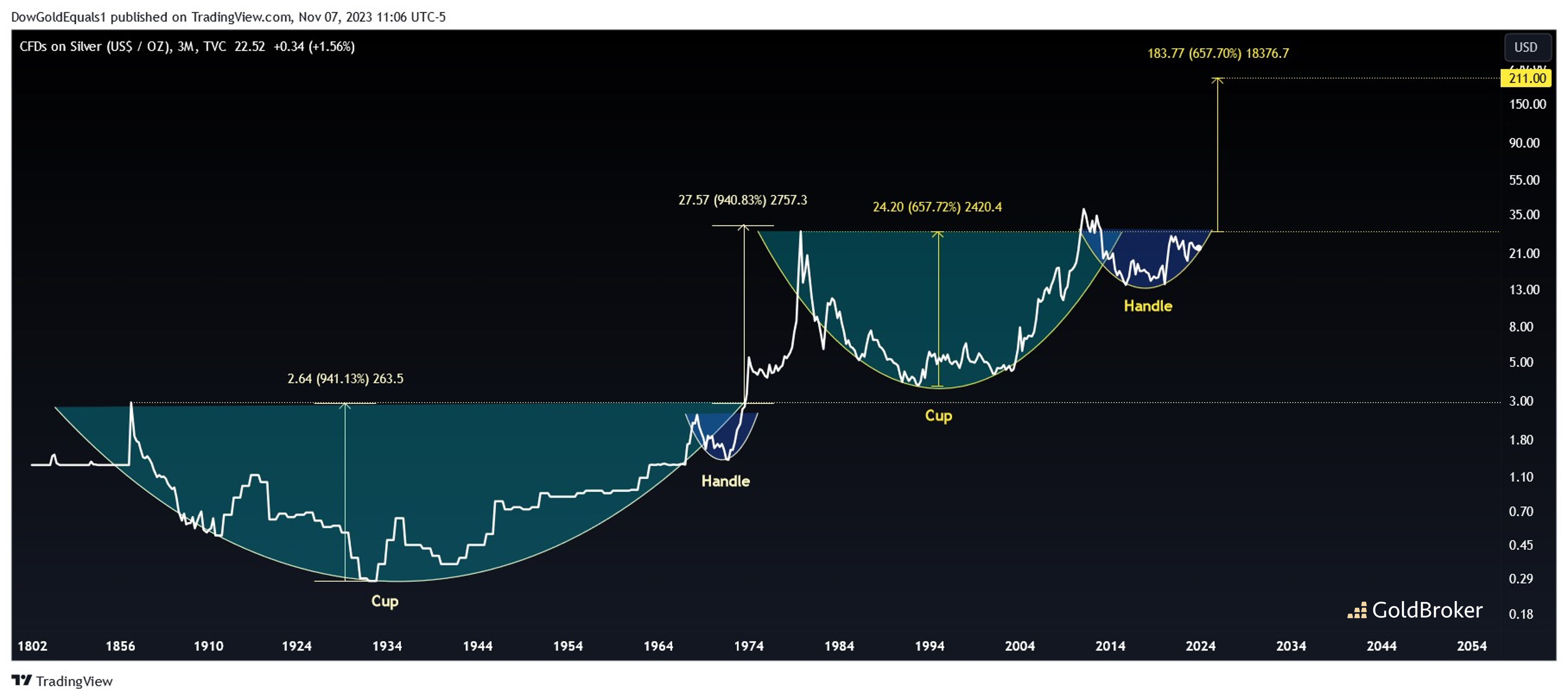
Next we'll look at silver price and first focus our attention on the current 40+ year Cup & Handle that often is scoffed at by detractors. Again, history is our guide, and if we look back far enough, we can see an incredible 100+ year C&H that occurred from the mid-1800s into later part of the 1900s that hit its quarterly measured move nearly perfectly. And while the current $200+ price target seems a long way off from current levels, who in the 1970s would have guessed $2 silver would hit $50 within a decade? When Silver exits its handle, the resulting move is impulsive. Lucky for us, that is the point we are quickly approaching!
Reproduction, in whole or in part, is authorized as long as it includes all the text hyperlinks and a link back to the original source.
The information contained in this article is for information purposes only and does not constitute investment advice or a recommendation to buy or sell.


